Some Changes In Google World

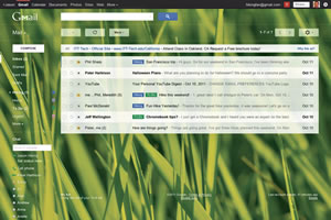
The new look of Google email
If you have a Gmail account you may have already noticed the new look.
At first glance I struggled with it, mostly because I’m just so used to the old look, but eventually the new look grew on me. If you really can’t stand it, you have the option to go back to the old look.
So what does the new look do for you?
Now you have much more control over the look of the service, allowing you to drag sidebars to your preferred size/width, choose from a wider selection of high-resolution background pictures, or decide whether you want lots of e-mail on your screen or more white space between your e-mails.
Additionally your conversations are more streamlined to help you keep track of who said what.
For Gmail’s mobile side, it released a new app for the iPhone, iPad and iPod touch. It brings your favorite features from the Gmail mobile app and iOS into one app so you can be more productive on the go. It’s designed to give you the information you need with minimal effort and distraction, such as being able to find an e-mail in seconds with a search across your entire inbox. Unfortunately shortly after this was released, they pulled it off the App Store temporarily because of a bug, but hopefully by the time this publishes it will be fixed.
On another side of Google, a new version of Google TV will soon be available on Sony and Logitech devices. As you may recall, it released the first version last year with partner Logitech and eventually slashed the price to $99 from $249 after it flopped.
This new version hopes to fix some of the shortcomings from the previous version and bring all Web videos, apps and network programming into one place to house “millions” of TV channels and simplify navigation.
The update is based on Honeycomb (Android), which is also used in tablets, and looks similar to the Apple TV interface. Prices vary, find a Google TV solution here: google.com/tv/get.html.


